TRU Centre for Excellence in Learning and Teaching

Author: cdishke

Great Spaces (3/3)

A few years ago I had the opportunity to attend the LearnxDesign conference hosted at the School of the Art Institute of Chicago. During the conference I presented a paper on a relatively recent project I had undertaken to better understand the needs of faculty with respect to some upcoming classroom renovations. Afterwards I was part of a team that edited a special issue of FORMakademisk about design in learning.

Seeing that my role once again is intersecting with the needs of faculty with respect to classroom and learning space design, it thought I would go back to that unpublished paper and pull forward a few basic principles of theory that were discussed at that conference, and also provide a quick summary of the results from the research project. These ideas are being presented in three parts, this, the second installment provides the results of our small study. The final post will bring forward some of my thoughts on what we need to consider for designing great learning spaces in the future.

As I’ve discussed in the last two posts, learning spaces influence our behaviour, and offer opportunities or constraints for what is possible. In this last post of the series I want to bring forward a few spaces that I think are exciting in their design and appear to function well for both teachers and learners.

In October 2019, I was in Terrace at the BCcampus Symposium. One of many highlights of the conference was a travelling dinner on the first night that was hosted in three different spaces. The Waap Galts’ap Community House (Longhouse), the Yurt, and the Frieda Diesing Studio.  The links direct you to Coast Mountain College’s website which provides information about the buildings, so I’ll encourage you to read more about them on the website, and just share why I think two of them are particularly interesting.

The Waap Galts’ap Community House has an arresting design, and it meets you before you even enter the campus. The building itself is much larger than what surrounds it, and the cedar posts and beams that comprise the building almost glow against the green grass and blue sky. Inside, a massive open room full of flexible seating, comfortable couches and bench seating provided plenty of options to find a comfortable place to sit and take in the many carvings and paintings. The open space and natural materials communicate that this is a place that holds meaning, that is meant for people to gather and spend time (not just move through) and connects the past and the future.

Waap Galts’ap Community House (The Longhouse). Coast Mountain College, Terrace, BC

Interior carvings of the Waap Galts’ap Community House (The Longhouse). Coast Mountain College, Terrace, BC

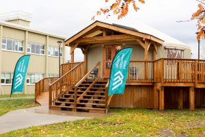
The Learning Lab Yurt was the space I was most excited to visit having heard about its design and construction at a conference the previous year. Built to serve as a learning lab, this round, tent-like building holds moving chairs, flip-top tables and a large television. To me it seemed like a hybrid space- both reflecting the nature of place- based experiential learning, while also maintaining the tools of a very modern classroom (no fur or fire pits). Despite the modernity, it was easy to feel at home in the space, and the gentle rain falling while we were in there was a distinct reminder of the direct influence of nature- quite unlike being in an interior classroom where the only sound is the HVAC system.

Learning Lab Yurt

Learning Lab Yurt – Coast Mountain College, Terrace, BC Photo – BCcampus

Now, to other northern spaces…

In the fall of 2018 I had the opportunity to spend some time with colleagues at the University of Southeast Norway. I have been impressed with USN’s campus for years, having visited several times as part of an ongoing collaborative research project since 2011. Each time I find myself taking photos of the spaces, the students’ work, and the amazing views from the cafeteria and upper atrium. Their spaces are dominated by unpainted wood, large windows that open wide (a rarity in modern buildings), and an abundance of casual places to gather and eat or talk.

Statue in courtyard at USN Notodden

Art in terraced rear outdoor courtyard. University of Southeast Norway Photo, author 2016

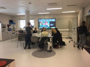
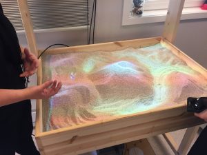
On my most recent visit I was invited on a tour of a recently-renovated space they had constructed called the DigTEKLab. More than what we might consider a Maker Space, these connected rooms offered a podcasting/ green screen room, flexible collaboration space with projection and whiteboards, sewing machines, craft supplies, a 3D printer and CNC milling machine, and a literal sandbox with a topographic projector overlay. As we consider the design and use of maker spaces in higher education, it reminds me that making is a particularity important way that humans create meaning out of abstract concepts. Whether it is through craft, art, design, cooking, or performance, spaces can give us the allowance to further understand and play with meaning.
Underlying everything I’ve thought about in the last few posts is that space conveys meaning and the design of the space can be a clear indication of its purpose and function.  Some spaces do it better than others. Engaging users in space design and thinking carefully about the constraints and opportunities can lead to gains in the long run.
 

The Meaning of Space (2/3)

A few years ago I had the opportunity to attend the LearnxDesign conference hosted at the School of the Art Institute of Chicago. During the conference I presented a paper on a relatively recent project I had undertaken to better understand the needs of faculty with respect to some upcoming classroom renovations. Afterwards I was part of a team that edited a special issue of FORMakademisk about design in learning. 

Seeing that my role once again is intersecting with the needs of faculty with respect to classroom and learning space design, it thought I would go back to that unpublished paper and pull forward a few basic principles of theory that were discussed at that conference, and also provide a quick summary of the results from the research project. These ideas are being presented in three parts, this, the second installment provides the results of our small study. The final post will bring forward some of my thoughts on what we need to consider for designing learning spaces in the future.

What do faculty and students want to see and feel in their classrooms? How and where do faculty teach best, and students learn best?  This is a summary of a small study where we tried to find answers these and other questions.

In collaboration with the Library at a mid-sized University in Ontario, students and faculty were invited to complete a survey and attend focus groups about learning space at the university in preparation for upcoming renovations.   Ethical approval was applied for and received, and participants agreed that their data could be shared providing their identities remained confidential. The response rate was very strong with 44 faculty completing the survey (nearly the entire faculty complement) and 100 students (out of approximately 1,200). Ten faculty members and eight students attended four focus groups. Students and faculty responses were recorded separately, and no incentive was provided for their participation in the survey or the focus groups.

The survey covered a variety of topics, including use and preference for types of technology (Apple/PC user, laptop or desktop) as well as preferences for space design, including furniture and lighting. The focus group questions concentrated more on how students and faculty actually made use of the learning spaces and what they would like to see changed. For example, focus group participants were to indicate on a paper map of the campus the spaces that they liked and used and those that they disliked or avoided, then explained why.

Responses have been summarised here to illustrate some of the most salient and general points that came out of these discussions. I have avoided summarizing specific complaints about particular classrooms, however that information was shared with the administration. As I move through the data now, almost five years later I realize how rich this information is and how generous the participants were with their experiences.

A few key findings:

First and foremost, faculty and students were very clear in their statements that space made them feel a certain way, and that space was not neutral in design or function. Students and faculty repeatedly stated that rooms with no windows were “depressing”, and that the rooms that hadn’t been renovated or re-painted in years were “uninspiring” or “gloomy”. There was no preference among faculty or students for active learning (flat) classrooms or tiered lecture halls.

Both faculty and students urged consistency in design and use. As they both travel in and out of different spaces though their days and weeks, different setups, different amenities and opportunities were confusing and changed the way the classes operated. Simply having computers that all used the same switches and the same number of white or blackboards in each room was seen a critical factor in comfort and easing frustration.

The campus in general invoked a distinct sense of nostalgia. That nostalgic space is positive in forming a sense of community, but was seen to reinforce hierarchies, including who had access to the most desirable spaces, and importantly, who did not. Who had keys to what was seen as an indicator of power and control.

There was an emerging understanding of the need for spaces that were accessible for a variety of body types and mobilities. Students in particular indicated that spaces were not designed for bodies that were built smaller or larger than average, and this brought forward discussion of specific cases where students were uncomfortable or unable to participate. A student shared an example about a newly renovated space where the new furniture couldn’t meet the needs of another specific student causing old furniture to have to be brought in for their use.

Lastly, and with emphasis, there are never enough power outlets.

I think these results are helpful in highlighting very basic considerations when thinking about learning spaces. Simple fixes like paint, consistent setup and an awareness of how bodies move through space are basic considerations that have a big impact. So much so that we likely don’t notice when they are done well- good spaces let learning come to the forefront. How we teach and learn is situated in a place, influenced by factors largely outside the control of both teachers and learners. Though we anticipated finding strong preferences for specific classroom designs given anecdotal conversations about large lecture halls vs. classes with moveable chairs, in this small sample there were no discernable preferences. One way of interpreting that finding is that the real difference is the teacher-student interaction, and that is more important than where people are located in a place. At CELT, we aim to support faculty and help them find ways to move students toward learning outcomes. Educators create structures that support learning.  When the end goal is a positive student learning experience, there are myriad good ways to get there, even when the space isn’t perfect. We must not forget that learning happens everywhere- it is not confined or limited to a classroom.


Learning Space (1/3)

A few years ago I had the opportunity to attend the LearnxDesign conference hosted at the School of the Art Institute of Chicago. During the conference I presented a paper on a relatively recent project I had undertaken to better understand the needs of faculty with respect to some upcoming classroom renovations. Afterwards I was part of a team that edited a special issue of FORMakademisk about design in learning.

Seeing that my role once again is intersecting with the needs of faculty with respect to classroom and learning space design, it thought I would go back to that unpublished paper and pull forward a few basic principles of theory that were discussed at that conference, and also provide a quick summary of the results from the research project. These ideas will be presented in three parts, the first (this one) looks at some of the basics and background of learning space design, the second the results of our small study, and the third, a summary of some of the current work being done in this area with thoughts about the future.

For many reasons, including but not limited to proximity, function, tradition, and personal aesthetic preferences, learning space use and allocation is a concern shared by students, faculty, administration, and staff. The placement of amenities such as eating areas and comfort facilities, the re-appropriation of classroom, lab, office, or library space, and what constitutes the best designs for a modern classroom bring forward debate and passionate opinions. What this means is that we are invested in, and interested in how our physical environments are constructed, especially those that we spend a great deal of time using.  They matter to how we feel, how we teach, and how we learn. Though we could naïvely reduce the act of learning to happening only in the mind, learning and teaching is truly an embodied practice- one’s body and mind co-exist within a space and engage in forms of learning that go beyond cognition and are influenced by the affordances and restrictions present in the physical and psychological environment. Both students and teachers are influenced by the context that they find themselves in, which means that the design and allocation of learning spaces has a direct influence on teaching and learning.

The study of learning environments is not new, and others have written extensively about how people learn in a variety of spaces (see Oblinger, 2006). As a social psychologist I am particularly rooted in the work of Lewin (1936) who stated that behaviour is a function of the person and the environment (BfPE). Lewin’s field theories argued that the physical and psychological words are both dynamic, fluid, and flexible, and that our mind interacts with physical space to create behaviour (Shoda, 2004). Systems theories further this point and address the ways that humans are connected to their environments and the myriad reciprocal interactions between behaviour and the environment which foster or hinder learning (Millová & Blatný, 2015). Social constructivist theories (see Vygotsky, 1978) argue that knowledge is socially situated and developed in relationship with others. All three of these theories focus more on the student as a learner, not on the teacher as a transmitter of information.

When we look at many traditional North American universities built in the 1960s-1980s to respond to the influx of students enrolling in universities, the institutional architecture was developed with the anticipation of teacher-centred learning which reflected and reinforced the idea of teaching as a form of transmission. Subsequently, the accompanying media and seating systems are designed as to facilitate a passive approach to learning (Biggs, 1999; Jamieson, 2003). One only needs to cast their mind to a theatre-style university classroom with tiered, fixed seating facing the front, to see how the environment dictates the type of activity (lack of activity) that is preferred. Only the instructor faces forward, looking to students to transmit knowledge through speech, visual presentations, and body language. On the other hand, many modern active learning classrooms have started to direct us away from this approach and provide moveable seating, flat floors, and sometimes ‘pods’ or group table with a shared screen and the ability to connect computers or phones to project content on the screen. In between these spaces exist flat classrooms with fixed seating, large lecture halls with flexible seating, and myriad purpose-built and retro-fitted designs that suit the esoteric wants and needs of specific people and places. It is now the case that universities contain all of these spaces- built up over time as campuses evolved and shifted to meet changing demands.

These various architectures present not only a challenge to instructors, but to students, facilities planners, staff who allocate classroom and meeting space, and coordinators who determine class size and composition. If behaviour is a function of a person and the environment, and we are unconsciously influenced in our learning and teaching by the physical space we find ourselves in, then we have an almost infinite number of variables including both the person and the environment which are interplay in each one of our classroom spaces. How do we physically equip spaces when we don’t have full awareness of the people, or the anticipated behaviours we are creating for? What are the salient pieces of classroom architecture that contribute to a better learning experience? What opportunity do we have to think about the assumptions at play in order to negotiate this complicated learning-space interaction? How does the physical classroom influence teaching as well as learning?

These questions and others were part of the impetus for the study we conducted as we tried to determine what space was being used for, and then develop a renovation plan to create spaces that would best meet the needs of the anticipated future users.


References

Biggs, J. (1999). Constructive alignment in university teaching. HERDSA Review of Higher Education (1). 1-22.

Jamieson, P. (2003). Designing more effective on‐campus teaching and learning spaces: A role for academic developers. International Journal for Academic Development, 8(1/2), 119‐133. Oblinger, D. (2006). Learning Spaces. Louisville, CO: Educause.

Millová, K., & Blatný, M. (2015). Personality development: Systems theories. (pp. 879-883) Elsevier Ltd. doi:10.1016/B978-0-08-097086-8.23035-3

Shoda, Y. (2004). Individual differences in social psychology: Understanding situations to understand people, understanding people to understand situations. The Sage handbook of methods in social psychology, 117-141.

Vygotsky, L. (1978). Mind in Society. London: Harvard University Press.

Powered by WordPress & Theme by Anders Norén